The colors in scientific plots are chosen for their boldness and contrast (to convey the message as unambiguously as possible). But heat maps can be cool in their own right. ☺ So why not occasionally leave off the axis labels and shift toward a more neutral palette? In this mini-album, I visit some simple models — exploring the space of parameters, dynamical variables, color representations — all in the name of aesthetics.
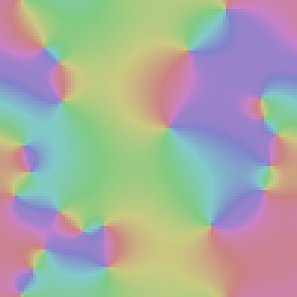
The XY model of ferromagnetism involves a lattice of spins, each allowed to rotate in the $$xy$$ plane (like a compass needle). The spin directions can be indicated with tiny arrows, or (in this case) with the colors of the spectrum. Spins tend to align with their neighbors, but are also subject to thermal kicks. As with the freezing/melting of water/ice, spin systems exhibit phase transitions. A perfect ice crystal corresponds to the ground state (where all squares have the same color). Here, a high temperature state (randomly colored squares) was quickly cooled, leading to the formation of color-patch domains. The points where many colors meet are vortices.
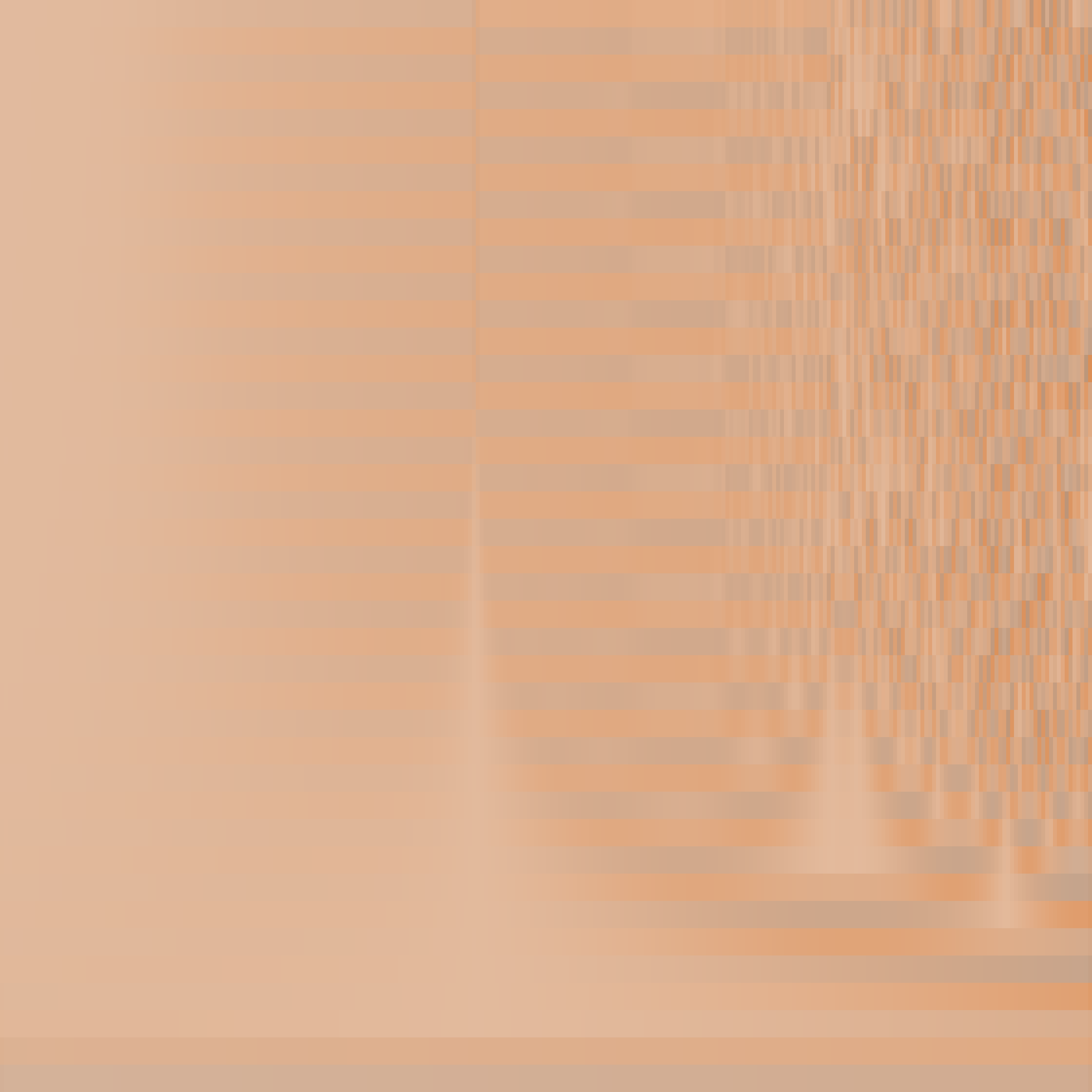
The logistic map is a simple model in nonlinear dynamics that can display chaotic behavior. It was originally formulated to model population growth in an environment with fixed carrying capacity. Here, the growth rate $$r$$ is varied horizontally, increasing from left to right. Generation number $$n$$ is displayed vertically, with $$n = 0$$ at the bottom. The saturation of the orange hue indicates population size $$x_n$$. Finally, the color is lightened in areas where the local $$r, n$$ variation is low. Oscillations appear as $$r$$ is increased past $$3$$ on the far left. The chaotic trajectories occupy the right third of the image, beginning at $$r \cong 3.57$$.
Not sure when I'll find time for more explorations in Parameter Space. Next up could be some aspect of turbulent fluid flow like vortex shedding, or perhaps some model involving cellular automata.
The XY model of ferromagnetism involves a lattice of spins, each allowed to rotate in the $$xy$$ plane (like a compass needle). The spin directions can be indicated with tiny arrows, or (in this case) with the colors of the spectrum. Spins tend to align with their neighbors, but are also subject to thermal kicks. As with the freezing/melting of water/ice, spin systems exhibit phase transitions. A perfect ice crystal corresponds to the ground state (where all squares have the same color). Here, a high temperature state (randomly colored squares) was quickly cooled, leading to the formation of color-patch domains. The points where many colors meet are vortices.
The logistic map is a simple model in nonlinear dynamics that can display chaotic behavior. It was originally formulated to model population growth in an environment with fixed carrying capacity. Here, the growth rate $$r$$ is varied horizontally, increasing from left to right. Generation number $$n$$ is displayed vertically, with $$n = 0$$ at the bottom. The saturation of the orange hue indicates population size $$x_n$$. Finally, the color is lightened in areas where the local $$r, n$$ variation is low. Oscillations appear as $$r$$ is increased past $$3$$ on the far left. The chaotic trajectories occupy the right third of the image, beginning at $$r \cong 3.57$$.
Not sure when I'll find time for more explorations in Parameter Space. Next up could be some aspect of turbulent fluid flow like vortex shedding, or perhaps some model involving cellular automata.